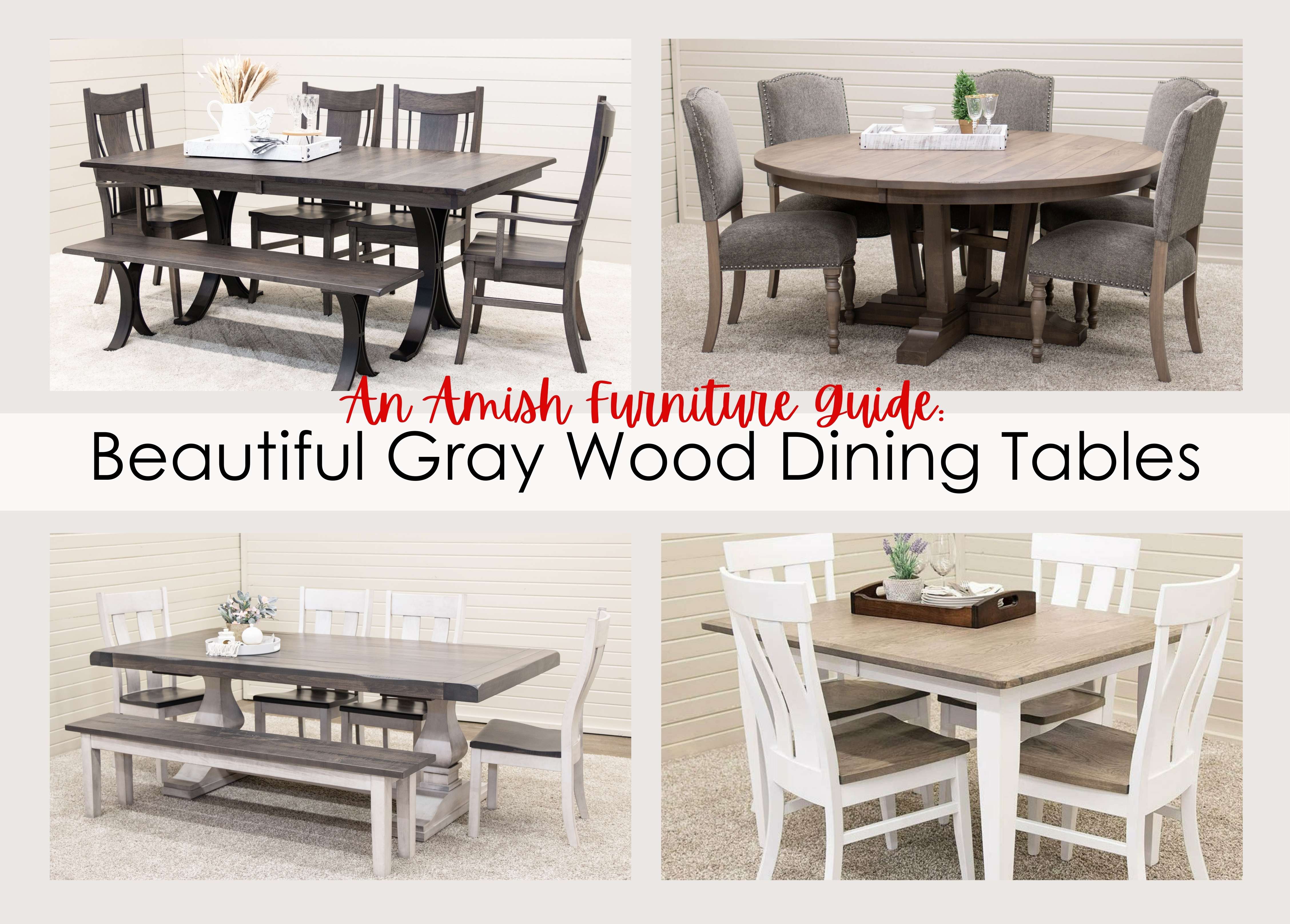


A Complete Guide to Mixing and Matching Wood Tones
Mixing and matching wood tones is one of the most rewarding ways to bring personality into your home. Forget the old rule of making everything match perfectly. Instead, use this complete guide to mixing and matching wood tones to transform your space into a harmonious and stylish environment.
Why People Mix and Match Wood Tones
Mixing and matching wood tones allows you to incorporate a variety of styles and finishes, making your décor feel personal instead of overly coordinated. However, many people miss the mark when they rely on random pairings without considering tone, undertone, and balance. When wood tones clash or groupings lack thoughtful placement, rooms lose flow. By understanding how to pair and distribute tones effectively, you can achieve a seamless look.
Understanding the Foundations of Wood Tones
Every piece of wood has two essential elements that dictate its compatibility with others in your space: its primary tone and its undertone. Primary tone refers to how light or dark the wood appears, ranging from pale, whitewashed shades to rich, deep stains. Undertone, on the other hand, describes the subtle color that peeks through the surface. It could be warm, with hints of red, yellow, or orange, or cool, with notes of gray, blue, or even green.
Identifying Dominant Tones
The dominant wood tone is the anchor of a room. It typically comes from the largest or most prominent wooden element in the room, such as the floors, cabinets, a dining table, or a bed frame. The dominant tone offers stability amidst the interplay of different woods.
For example, light oak floors can work as your base, creating a bright and airy feel that pairs beautifully with medium or dark furniture for contrast. If you’re working with dark cherry floors, consider light tones in your furniture so the room doesn’t feel heavy.
If your space doesn’t have a dominant tone, choose a versatile wood with a neutral palette, such as walnut or white oak. Both types are excellent starting points since they blend seamlessly with warm- and cool-toned woods.
Knowing Your Undertones
Undertones dictate the mood and harmony of your space. Warm undertones, such as those in cherry, red oak, and maple, evoke a sense of coziness and tradition. Cool undertones, like ash or walnut stains, lend a contemporary and refined touch. Choosing furniture and accents with matching undertones creates a unified look, even when the woods vary in tone or color.
Pairing warm maple furniture with a red-toned cherry coffee table maintains visual consistency and adds warmth to the space. You might also combine soft-gray ash floors with a deep charcoal-stained dining table for a cool, sophisticated vibe.
Be mindful when introducing contrasting undertones. While they can work in a very intentional design, misaligned undertones may create dissonance across the room.
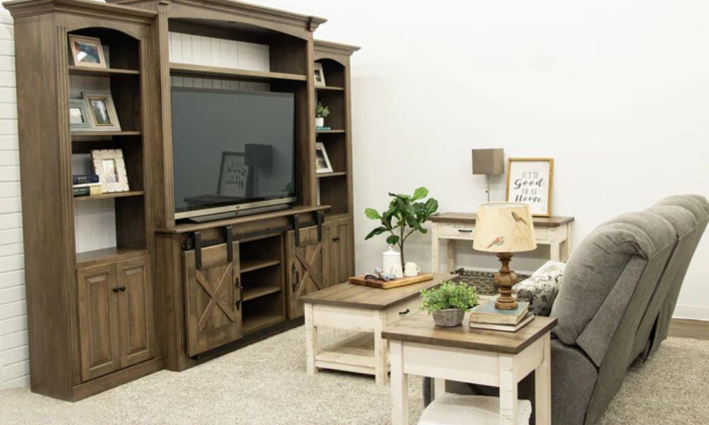
Light, Medium, and Dark Balance
Ideally, a room incorporates a spectrum of wood tones, from light to dark. Balancing these tones prevents your space from appearing flat or chaotic. Think of it like building a story with layers—each tone adds dimension.
For instance, using a pale pine dresser alongside medium-tone oak dining chairs and a dark walnut coffee table can create a visually compelling arrangement. The light wood adds brightness, the medium tone balances the palette, and the dark wood grounds the space with weight and presence.
Keep this rule of thumb in mind: aim for at least three distinct levels of tone variation.

Creating Visual Harmony
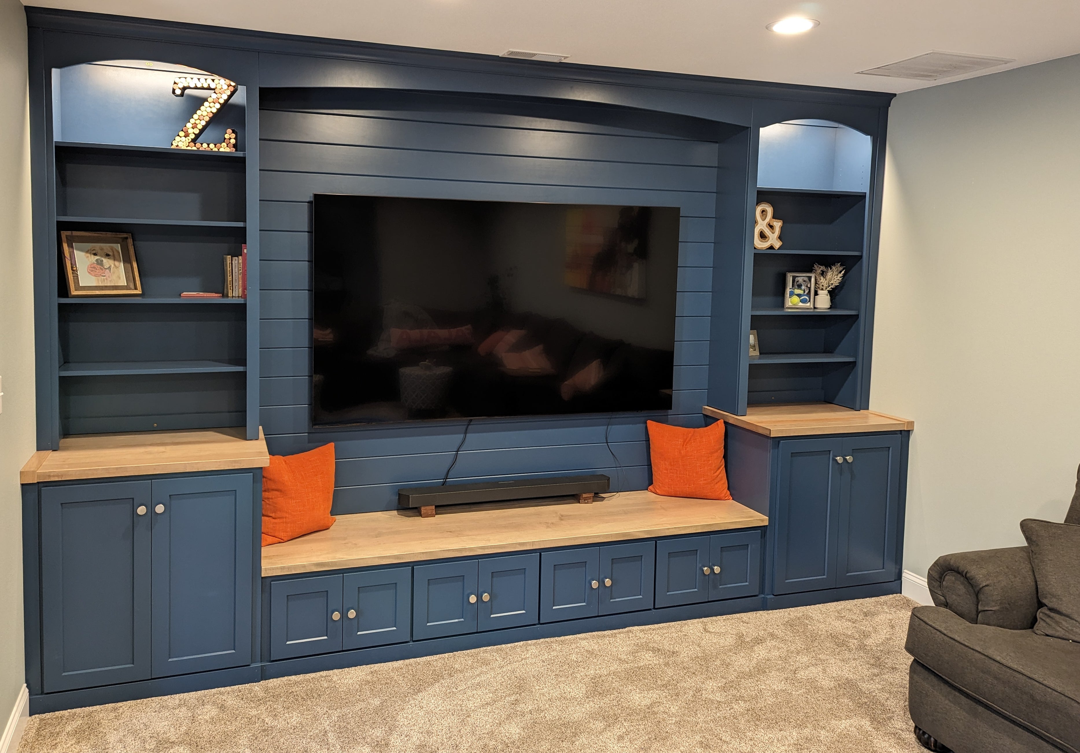
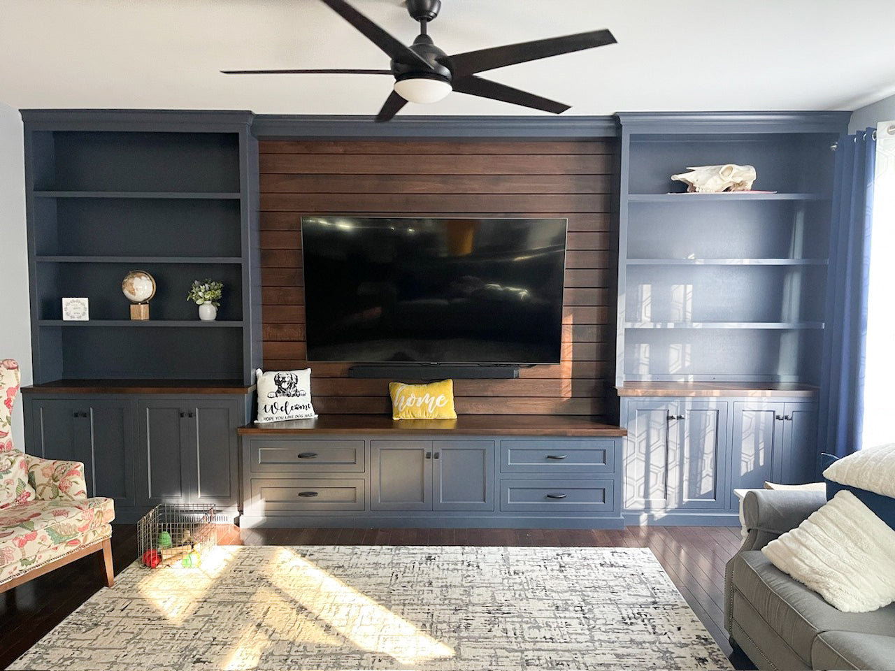
Successfully mixing and matching wood tones boils down to thoughtful placement and repetition. Each choice should be intentional, with every piece supporting the overall flow of the room. When you scatter tones unevenly or feature them only once, the room can look disjointed. Avoid this by incorporating each wood tone at least twice within the space.
A dark walnut console table, for example, could stick out awkwardly on its own. When paired with a matching walnut mirror frame or a lamp base, it fits seamlessly into the room. Additionally, avoid clumping all your dark furniture in one corner while leaving another area dominated by light tones. Instead, stagger your pieces for balance.
If you have a dark walnut chair, place it on the “lighter” side of the room and balance it with a medium oak side table nearby. This approach creates flow and ensures no single area appears too dark or too light.
Layering Textures and Decorative Anchors
Mixing wood tones doesn’t end with selecting furniture pieces. To create a cohesive space, you must incorporate texture and décor. These accessories tie together the various wood tones while enhancing the room’s overall aesthetic.
Rugs and Soft Furnishings
Rugs and upholstery soften the transitions between contrasting wood tones and work as foundational elements in your design. By introducing textiles in neutral shades, you create a visual buffer that harmonizes the room’s layers.
For instance, a warm beige or a cool-gray rug beneath a walnut coffee table and an ash side chair keeps the space cohesive and invites comfort into the design. This principle applies to cushions and throws as well. A cream cushion placed on a dark wood chair or a subtle pattern in a sofa’s upholstery can easily bridge tonal differences.
Small Accents
Decorative accents, such as bowls, lamps, trays, and mirrors, can complement and amplify the existing wood tones in your furniture. When selecting these accents, lean on ceramics, woven baskets, or metallic finishes to introduce variety. This keeps the room from feeling too wood-heavy. For example, a bronze vase on a walnut console table introduces contrast while maintaining an organic feel.
Texture as a Binding Element
The texture of wood itself can be a powerful design tool. Smooth finishes, such as polished mahogany or cherry, lend sophistication but can also feel too stark in excess. Adding rough or distressed textures, like weathered oak or reclaimed wood, brings warmth. For example, pair a clean-lined walnut coffee table with a rugged oak bench to achieve the perfect balance between modern and rustic.

You’ve Got the Ideas, We’ve Got the Furniture
At Dutch Craft Furniture, we believe your home tells a story, and our handcrafted pieces bring that narrative to life! We partner with skilled Ohio Amish furniture makers to create timeless pieces that complement any wood tone palette.
Whether you’re layering light maple with dark walnut or searching for a spalted grain piece to tie your space together, our collection features the variety you desire. Stop by our Berlin, Ohio showroom or explore our selection online to discover the perfect furniture for your style.